Data Trends & Misleading Graphs
By the end of this lesson, you’ll be able to:
- Identify positive, negative, nonlinear, and no clear trends in data.
- Interpret trends in graphs and real-world contexts.
- Compare rates of change using the steepness of a graph.
- Recognize misleading graph features such as truncated axes and inconsistent scales.
- Distinguish what a graph actually shows from conclusions that are not supported by the data.
Key Ideas
A trend describes the general pattern or direction in a set of data.
Common patterns include:
- Positive trend: as one variable increases, the other tends to increase.
- Negative trend: as one variable increases, the other tends to decrease.
- No clear trend: the data do not show a consistent increasing or decreasing pattern.
- Nonlinear trend: the data follow a curved rather than approximately straight pattern.
For example, in a scatterplot:
- points generally rising from left to right suggest a positive trend
- points generally falling from left to right suggest a negative trend
- points scattered without a clear direction suggest no clear trend
- points following a curve suggest a nonlinear relationship
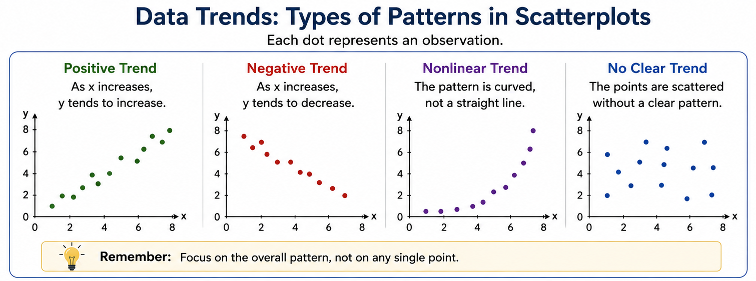
Trend vs. Individual Data Points
When identifying a trend, focus on the overall pattern, not on one unusual point.
A dataset can have a strong positive trend even if a few individual points do not follow the pattern exactly.
A trend describes what the data generally do. It does not mean every data point must follow the pattern perfectly.
Reading Rate of Change From a Graph
For a line graph, the steepness of the line indicates how quickly the quantity is changing.
- Steeper upward slope → faster increase
- Less steep upward slope → slower increase
- Steeper downward slope → faster decrease
- Horizontal line → no change
For a straight line, this rate of change is its slope.
A curved graph has a changing rate of change, so its behavior is nonlinear.
Misleading Graphs
Graphs can display correct numbers while still creating a misleading visual impression.
Always inspect the axes, scales, and labels before drawing a conclusion.
1. Truncated or Non-Zero Axes
A graph does not always begin at zero.
For example, suppose two values are:
\[ 98 \quad \text{and} \quad 100 \]
The actual difference is only:
\[ 100-98=2 \]
If a bar graph begins at \(95\) instead of \(0\), however, the bar for \(100\) may appear much taller than the bar for \(98\).
The data are still correct, but the visual difference is exaggerated.
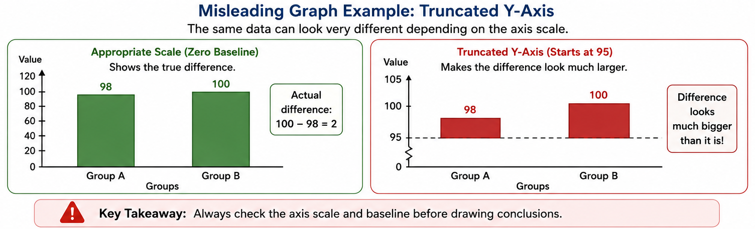
A non-zero axis is not automatically wrong. The question is whether the chosen scale creates a misleading impression of the size of the difference.
2. Broken Axes
A broken axis skips part of the numerical scale.
It is usually shown using a small break or zigzag in the axis.
Broken axes can be useful when values are clustered closely together, but they can also make small differences appear much larger than they really are.
3. Inconsistent Tick Marks
Equal visual distances should normally represent equal numerical changes.
For example, suppose an axis shows:
\[ 2010,\quad 2020,\quad 2021 \]
If all three labels are equally spaced, the graph visually treats a 10-year interval and a 1-year interval as though they were the same length.
That can distort the apparent rate of change.
4. Misleading Bar Widths or 3D Effects
In a standard bar graph, height represents the value.
Changing the widths of bars or adding 3D perspective can make some categories appear larger than their actual values suggest.
5. Cherry-Picked Time Intervals
The time period shown can strongly affect the apparent trend.
For example, a quantity may increase over 10 years but temporarily decrease during the final year.
Showing only that final year could create the impression of a long-term decline.
Always ask:
What time period is being shown, and what information might be missing?
Common Problem Types
1. Identifying the Direction of a Trend
Look at the overall direction of the data from left to right.
Example:
If points generally rise as \(x\) increases, the data show a positive trend.
2. Recognizing a Nonlinear Trend
A relationship is nonlinear when its pattern bends or curves rather than following an approximately straight path.
Example:
A population grows slowly at first and then increasingly rapidly.
The graph becomes steeper over time, producing a curved pattern.
3. Comparing Rates of Change
For straight-line graphs, compare their slopes.
A steeper line represents a greater magnitude of rate of change.
Example:
If two quantities are both increasing, the steeper line is increasing faster.
4. Detecting a Misleading Axis Scale
Check where the axis begins and how its values are spaced.
Example:
A bar graph comparing values of \(98\) and \(100\) begins its vertical axis at \(95\).
The difference may look dramatic even though the actual difference is only \(2\).
5. Recognizing Broken or Inconsistent Axes
Look for:
- zigzags or breaks in an axis
- skipped numerical ranges
- unequal numerical intervals shown with equal spacing
These features can change how large a difference or slope appears.
6. Evaluating a Claimed Trend
Sometimes a problem gives both a graph and a statement about the graph.
Ask whether the statement is actually supported by the data.
For example, a positive association between two variables does not by itself prove that one variable causes the other.
Strategies
- Check the axes first. Read the labels, units, starting values, and scale.
- Look at the overall pattern, not one isolated point.
- For straight lines, use steepness to compare rates of change.
- For curved patterns, recognize that the rate of change is changing.
- In bar graphs, compare the values represented by the heights—not just their visual appearance.
- Watch for truncated axes, broken axes, inconsistent intervals, and 3D effects.
- Consider whether the graph shows the full relevant time period.
- Separate association from causation.
Worked Examples
Example 1 — Identify a Trend
A scatterplot shows that as hours studied increase, test scores generally increase.
The points rise from left to right.
Therefore, the graph shows a:
\[ \boxed{\text{positive trend}} \]
This does not mean every student who studies more must score higher. It describes the overall pattern in the data.
Example 2 — Misleading y-Axis
A bar graph compares two values:
\[ 96 \quad \text{and} \quad 100 \]
The vertical axis begins at \(95\).
The actual difference is:
\[ 100-96=4 \]
Because the graph displays only the range above \(95\), the second bar may appear several times taller than the first.
The graph therefore:
\[ \boxed{\text{visually exaggerates the difference}} \]
Example 3 — Inconsistent Time Scale
A graph has equally spaced labels:
\[ 2010,\quad 2020,\quad 2021 \]
But:
\[ 2020-2010=10\text{ years} \]
while:
\[ 2021-2020=1\text{ year} \]
Those intervals should not normally occupy the same horizontal distance.
The graph may therefore give a misleading impression of the rate of change.
Example 4 — Comparing Rates of Change
Two straight lines both rise from left to right.
Line A rises \(8\) units while Line B rises \(3\) units over the same horizontal distance.
Line A has the steeper slope.
Therefore:
\[ \boxed{\text{Line A has the faster rate of increase}} \]
Example 5 — Nonlinear Trend
A graph rises slowly at first and then becomes increasingly steep.
Because the slope is changing rather than remaining constant, the relationship is:
\[ \boxed{\text{nonlinear}} \]
- Ignoring the scale or starting value of an axis.
- Assuming that a graph must begin at zero in every situation.
- Looking at one unusual data point instead of the overall trend.
- Treating a curved trend as though it has one constant slope.
- Comparing the visual size of bars without checking their numerical values.
- Assuming that correlation or association proves causation.
- Assuming a graph shows the entire relevant time period.
Practice Problems
A scatterplot generally rises from left to right. What type of trend does it show?
A bar graph compares values of \(92\) and \(96\), but its vertical axis begins at \(90\). How might this affect the graph’s appearance?
Two straight lines increase over the same horizontal interval. Line A is steeper than Line B. Which quantity is increasing faster?
A scatterplot has points spread throughout the graph with no clear upward or downward pattern. What does this indicate?
A graph rises slowly at first and then becomes increasingly steep. Is the trend linear or nonlinear?
A horizontal axis places 2000, 2020, and 2021 at equal distances from one another. Why could this be misleading?
A graph shows that students who sleep more tend to have higher test scores. Can you conclude from this graph alone that additional sleep causes higher scores?
1.
The points generally rise as you move from left to right.
That means larger values of one variable tend to occur with larger values of the other.
\[ \boxed{\text{Positive trend}} \]
2.
The actual difference is:
\[ 96-92=4 \]
Because the graph begins at \(90\) rather than \(0\), that relatively small difference may occupy a large portion of the displayed vertical scale.
Therefore, the graph may:
\[ \boxed{\text{exaggerate the visual difference}} \]
3.
For straight lines, a steeper upward slope represents a faster rate of increase.
Since Line A is steeper:
\[ \boxed{\text{Line A is increasing faster}} \]
4.
The points do not show a consistent increasing or decreasing pattern.
Therefore:
\[ \boxed{\text{There is no clear trend or association}} \]
5.
The graph becomes steeper as it moves to the right.
That means its rate of change is changing rather than remaining constant.
Therefore:
\[ \boxed{\text{Nonlinear trend}} \]
6.
The time intervals are not equal:
\[ 2020-2000=20 \]
but:
\[ 2021-2020=1 \]
Displaying both intervals with the same horizontal spacing can distort the apparent rate of change.
\[ \boxed{\text{The time scale is inconsistent}} \]
7.
No.
The graph may show an association between sleep and test scores, but other variables could affect both.
Therefore:
\[ \boxed{\text{Association does not prove causation}} \]
Summary
- A positive trend generally rises from left to right.
- A negative trend generally falls from left to right.
- No clear trend means there is no consistent increasing or decreasing pattern.
- A nonlinear trend follows a curved pattern.
- Steeper straight lines represent greater rates of change.
- Axis choices can dramatically affect how differences appear.
- Watch for truncated axes, broken scales, inconsistent intervals, and distorted bar graphs.
- Always distinguish what the data show from conclusions the data cannot support.
- Check the axes before interpreting the graph.
- Look at the overall pattern, not one point.
- Steeper straight line = greater rate of change.
- Curved pattern = changing rate of change.
- A non-zero axis is not automatically misleading—but it can exaggerate differences.
- Equal visual spacing should represent equal numerical intervals.
- Association does not prove causation.