Line of Best Fit
By the end of this lesson, you’ll be able to:
- Understand what a line of best fit represents.
- Estimate slope and intercept from a scatterplot.
- Select an equation that matches a line of best fit.
- Make predictions using the line.
- Interpret slope and intercept in context.
- Recognize the difference between interpolation and extrapolation.
- Use Desmos to generate a linear regression model.
Key Ideas
A line of best fit, also called a trend line, summarizes the overall linear pattern in a scatterplot.
It does not usually pass through every data point. Instead, it is drawn so that it represents the general direction of the data as closely as possible.
A line of best fit can:
- summarize the overall trend
- smooth out random variation
- estimate the relationship between two variables
- help make predictions
A linear model is typically written as:
\[ \boxed{ \hat{y}=mx+b } \]
where:
- \(m\) is the slope
- \(b\) is the y-intercept
- \(\hat{y}\) is the predicted value of \(y\)
The symbol \(\hat{y}\) is read as “y-hat.”
It reminds us that the line gives a prediction rather than necessarily the exact observed value.
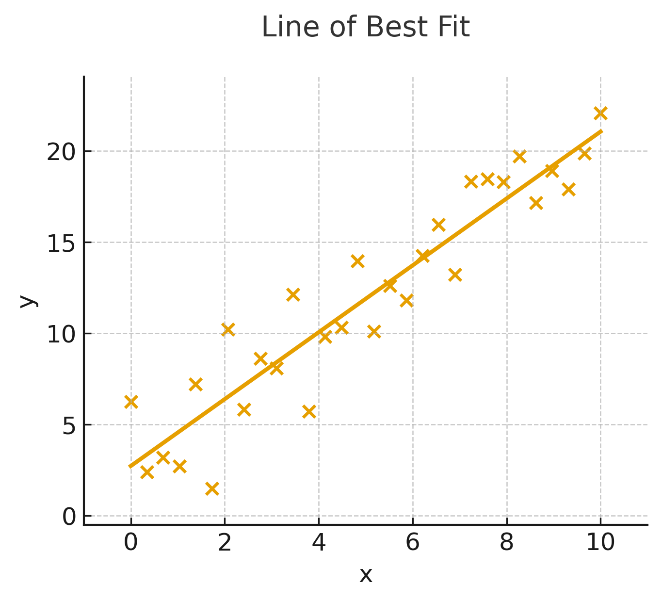
A line of best fit is most useful when the scatterplot shows a reasonably clear linear association.
If the points follow a curved pattern or show no clear association, a linear model may not be appropriate.
Estimating the Line
A line of best fit should run through the overall center of the data cloud.
Ideally:
- some points lie above the line
- some points lie below the line
- the line follows the overall direction of the data
The line is intended to represent the trend, not individual observations.
Common Problem Types
1. Estimating Slope From the Line
To estimate slope, choose two convenient points on the line of best fit.
Do not automatically choose two scatterplot points unless they also lie on the line.
Recall:
\[ m=\frac{y_2-y_1}{x_2-x_1} \]
Suppose the line passes through:
\[ (2,10) \]
and:
\[ (6,18) \]
Then:
\[ m = \frac{18-10}{6-2} = \frac{8}{4} = \boxed{2} \]
The slope is:
\[ \boxed{2} \]
2. Identifying the Y-Intercept
The y-intercept is where the line crosses the y-axis.
At the y-intercept:
\[ x=0 \]
Suppose the line crosses the y-axis at:
\[ (0,4) \]
Then:
\[ \boxed{b=4} \]
and the line has the form:
\[ \hat{y}=mx+4 \]
3. Selecting an Equation for the Line of Best Fit
Many questions ask which equation best represents a line shown on a scatterplot.
Estimate:
- the slope
- the y-intercept
Then compare those estimates with the answer choices.
Suppose the graph appears to have:
\[ m\approx2 \]
and:
\[ b\approx5 \]
A reasonable model is:
\[ \boxed{ \hat{y}=2x+5 } \]
You often do not need exact values.
Estimate the slope and intercept closely enough to distinguish among the answer choices.
4. Making Predictions
Once you have an equation, substitute an \(x\)-value to predict \(y\).
Suppose:
\[ \hat{y}=3x+2 \]
Predict \(y\) when:
\[ x=5 \]
Substitute:
\[ \hat{y} = 3(5)+2 = 15+2 = \boxed{17} \]
The model predicts:
\[ \boxed{17} \]
5. Interpreting Slope in Context
The slope represents the predicted change in \(y\) for each 1-unit increase in \(x\).
Suppose:
\[ \hat{y}=0.8x+72 \]
where:
- \(x\) = hours studied
- \(\hat{y}\) = predicted test score
The slope is:
\[ 0.8 \]
A good interpretation is:
For each additional hour studied, the predicted test score increases by about 0.8 points.
Because this comes from observed data, it is often safer to say:
Each additional hour studied is associated with an increase of about 0.8 points in the predicted test score.
Always include the appropriate units.
6. Interpreting the Y-Intercept in Context
The y-intercept represents the predicted value of \(y\) when:
\[ x=0 \]
Suppose:
\[ \hat{y}=0.8x+72 \]
The intercept is:
\[ 72 \]
If \(x\) represents hours studied, then the model predicts a test score of:
\[ \boxed{72} \]
when:
\[ x=0 \]
hours are studied.
The y-intercept always has a mathematical meaning, but it may not always have a useful real-world interpretation.
If \(x=0\) is outside the range of realistic or observed values, interpret the intercept cautiously.
7. Interpolation and Extrapolation
Interpolation
Interpolation means making a prediction within the range of observed \(x\)-values.
Suppose data were collected for:
\[ 2\le x\le10 \]
Predicting at:
\[ x=6 \]
is interpolation.
This is usually more reliable because the prediction stays within the region where data were actually observed.
Extrapolation
Extrapolation means making a prediction outside the observed range.
Using the same data range:
\[ 2\le x\le10 \]
predicting at:
\[ x=25 \]
is extrapolation.
This may be less reliable because the observed trend might not continue far beyond the data.
A linear trend observed over one range of values may not continue indefinitely.
Predictions far outside the observed data range should be treated cautiously.
8. Comparing Predicted and Observed Values
A data point does not usually lie exactly on the line of best fit.
Suppose the model predicts:
\[ \hat{y}=80 \]
for a particular \(x\)-value, but the actual data point has:
\[ y=84 \]
The line gives a prediction of 80, while the observed value is 84.
The difference between the actual and predicted values is called a residual:
\[ \text{residual}=y-\hat{y} \]
Here:
\[ \text{residual} = 84-80 = \boxed{4} \]
A positive residual means the observed point lies above the line.
A negative residual means the observed point lies below the line.
You may not always be asked to calculate residuals, but the idea helps explain why a line of best fit does not need to pass through every point.
Using Desmos to Generate a Line of Best Fit
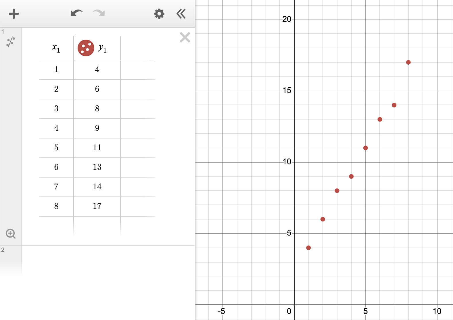
Desmos can calculate a linear regression model directly from a table of data.
Step 1: Enter the Data
Create a table in Desmos and enter the \(x\)- and \(y\)-values.
Step 2: Create the Regression Model
Below the table, enter:
y_1 ~ mx_1 + b
The symbol ~ tells Desmos to perform a regression rather than graph an ordinary equation.
Desmos then estimates the values of \(m\) and \(b\) that best fit the data.
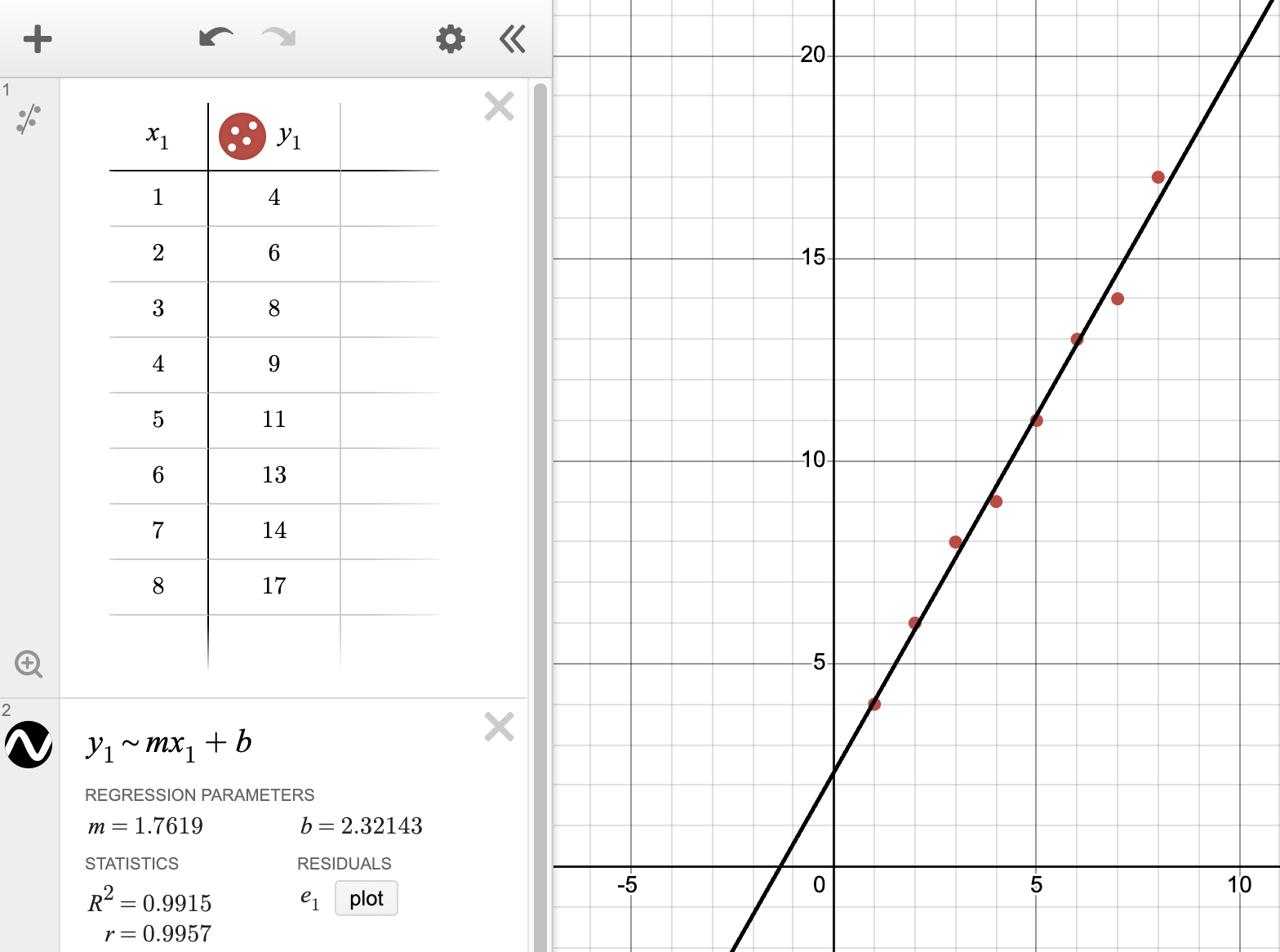
Typing y_1 ~ mx_1 + b asks Desmos to find the linear model that best fits the data in the table.
Interpreting the Desmos Results
Suppose Desmos reports:
\[ m=2.1 \]
and:
\[ b=5.3 \]
Then the regression equation is approximately:
\[ \boxed{ \hat{y}=2.1x+5.3 } \]
The slope means that for every 1-unit increase in \(x\), the predicted value of \(y\) increases by about:
\[ 2.1 \]
The intercept means the predicted value of \(y\) when:
\[ x=0 \]
is approximately:
\[ 5.3 \]
A visually drawn line of best fit may not exactly match the regression equation produced by technology.
If a question gives you a specific line on a graph, use that line.
If a question gives you regression output, use the regression equation provided.
Strategies
- Check whether the scatterplot shows a reasonably linear pattern.
- Choose points on the line of best fit, not random scatterplot points.
- Use points that are far apart when estimating slope; this can reduce estimation error.
- Check the scale of both axes before calculating slope.
- Estimate the y-intercept from where the line crosses the y-axis.
- Use \(\hat{y}\) to represent predicted values.
- Include units when interpreting slope.
- Interpret the y-intercept only when \(x=0\) makes sense in context.
- Use interpolation more confidently than extreme extrapolation.
- Remember that a trend represents association, not necessarily causation.
Worked Examples
Example 1 — Find the Equation
A line of best fit passes through:
\[ (0,5) \]
and:
\[ (4,13) \]
Find the equation of the line.
Solution
First calculate the slope:
\[ m = \frac{13-5}{4-0} = \frac{8}{4} = 2 \]
Because the line passes through:
\[ (0,5) \]
the y-intercept is:
\[ b=5 \]
Substitute into:
\[ \hat{y}=mx+b \]
to get:
\[ \boxed{ \hat{y}=2x+5 } \]
Example 2 — Make a Prediction
Use:
\[ \hat{y}=2x+5 \]
to predict \(y\) when:
\[ x=10 \]
Solution
Substitute:
\[ \hat{y} = 2(10)+5 = 20+5 = \boxed{25} \]
The predicted value is:
\[ \boxed{25} \]
Example 3 — Interpret the Slope
A line of best fit has slope:
\[ 0.4 \]
where:
- \(x\) = hours studied
- \(y\) = test score
Interpret the slope.
Solution
A 1-hour increase in study time corresponds to an increase of about:
\[ 0.4 \]
points in the predicted test score.
Therefore:
Each additional hour studied is associated with an increase of about 0.4 points in the predicted test score.
Example 4 — Interpolation or Extrapolation?
A model was created using data for:
\[ 1\le x\le8 \]
Classify each prediction.
Prediction A
\[ x=5 \]
Since 5 lies inside the observed range:
\[ \boxed{\text{interpolation}} \]
Prediction B
\[ x=20 \]
Since 20 lies outside the observed range:
\[ \boxed{\text{extrapolation}} \]
Prediction B should generally be treated with more caution.
Example 5 — Find a Residual
A model predicts:
\[ \hat{y}=42 \]
for a particular value of \(x\).
The actual observed value is:
\[ y=46 \]
The residual is:
\[ y-\hat{y} \]
So:
\[ 46-42 = \boxed{4} \]
Because the residual is positive, the observed point lies above the line of best fit.
Common Mistakes
- Choosing two random data points instead of two points on the line of best fit.
- Forgetting to check the scales on the axes.
- Treating \(\hat{y}\) as an exact observed value rather than a prediction.
- Ignoring units when interpreting slope.
- Assuming every scatterplot should be modeled with a straight line.
- Treating the y-intercept as meaningful in context when \(x=0\) is unrealistic.
- Extrapolating far outside the observed data range without caution.
- Assuming that association shown by the line proves causation.
- Confusing the actual value \(y\) with the predicted value \(\hat{y}\).
Practice Problems
A line passes through \((1,4)\) and \((3,10)\). Find the slope.
A line crosses the y-axis at 7. What is the y-intercept?
If
\[ \hat{y}=1.5x+2 \]
predict \(y\) when:
\[ x=8 \]
- A model has slope:
\[ 0.4 \]
where \(x\) is hours studied and \(y\) is test score. Interpret the slope.
A line appears to have slope 3 and y-intercept 4. Write a reasonable equation for the line.
A model is based on data for:
\[ 3\le x\le12 \]
Is a prediction at \(x=8\) interpolation or extrapolation?
Using the same model, is a prediction at \(x=30\) interpolation or extrapolation?
A model predicts \(\hat{y}=75\), but the observed value is \(y=72\). Find the residual.
1
Use the slope formula:
\[ m = \frac{10-4}{3-1} = \frac{6}{2} = \boxed{3} \]
2
The y-intercept is where:
\[ x=0 \]
The line crosses the y-axis at 7, so:
\[ \boxed{b=7} \]
3
Substitute:
\[ x=8 \]
into:
\[ \hat{y}=1.5x+2 \]
Then:
\[ \hat{y} = 1.5(8)+2 = 12+2 = \boxed{14} \]
4
The slope is:
\[ 0.4 \]
Therefore:
Each additional hour studied is associated with an increase of about 0.4 points in the predicted test score.
5
Use:
\[ \hat{y}=mx+b \]
with:
\[ m=3 \]
and:
\[ b=4 \]
Therefore:
\[ \boxed{ \hat{y}=3x+4 } \]
6
The observed range is:
\[ 3\le x\le12 \]
Since:
\[ 8 \]
lies inside the range:
\[ \boxed{\text{interpolation}} \]
7
Since:
\[ 30>12 \]
the prediction lies outside the observed data range.
Therefore:
\[ \boxed{\text{extrapolation}} \]
8
Use:
\[ \text{residual}=y-\hat{y} \]
Substitute:
\[ \text{residual} = 72-75 = \boxed{-3} \]
The negative residual means the observed point lies below the line of best fit.
Summary
A line of best fit summarizes a linear trend in a scatterplot.
Its equation is:
\[ \boxed{ \hat{y}=mx+b } \]
where:
- \(m\) represents the predicted rate of change
- \(b\) represents the predicted value when \(x=0\)
- \(\hat{y}\) represents a predicted value
Use the line to:
- estimate slope and intercept
- select an appropriate equation
- make predictions
- interpret the relationship in context
Predictions within the observed data range are called interpolation.
Predictions outside the observed range are called extrapolation and should be treated more cautiously.
- Use points on the line, not random scatterplot points.
- Check axis scales before calculating slope.
- \(\hat{y}\) means predicted y.
- Slope = predicted change in \(y\) for a 1-unit increase in \(x\).
- Intercept = predicted \(y\) when \(x=0\).
- Interpolation is usually safer than extrapolation.
- A line of best fit describes association, not necessarily causation.
- In Desmos, use
y_1 ~ mx_1 + bfor linear regression.