Scatterplot Interpretation
By the end of this lesson, you’ll be able to:
- Identify patterns and unusual points in scatterplots.
- Describe relationships by direction, form, and strength.
- Distinguish positive, negative, and no clear association.
- Recognize linear and nonlinear patterns.
- Interpret scatterplot relationships in context.
- Understand why association does not necessarily imply causation.
Key Ideas
A scatterplot shows the relationship between two numerical variables.
Each point represents one observation with an \(x\)-value and a \(y\)-value.
For example, a scatterplot might compare:
- hours studied and test score
- temperature and electricity use
- height and weight
- age and reaction time
When interpreting a scatterplot, look for four main features:
- Direction
- Form
- Strength
- Unusual features, such as outliers or clusters
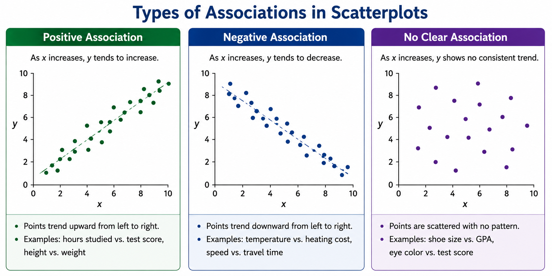
Direction
Direction describes whether \(y\) tends to increase or decrease as \(x\) increases.
Positive Association
A scatterplot has a positive association when larger values of \(x\) tend to be associated with larger values of \(y\).
Visually, the points generally rise from left to right.
For example:
As hours studied increase, test scores tend to increase.
This describes a positive association.
Negative Association
A scatterplot has a negative association when larger values of \(x\) tend to be associated with smaller values of \(y\).
Visually, the points generally fall from left to right.
For example:
As temperature increases, hot chocolate sales tend to decrease.
This describes a negative association.
No Clear Association
Sometimes the points show no consistent upward or downward pattern.
In that case, there is no clear association between the variables.
For example, shoe size and GPA would likely show little or no clear association.
Form
The form describes the overall shape of the relationship.
Linear Association
If the points follow an approximately straight-line pattern, the relationship is linear.
The points do not need to lie exactly on a line.
They only need to follow a roughly straight pattern.
Nonlinear Association
If the points follow a curved pattern, the relationship is nonlinear.
For example, the points might:
- rise quickly and then level off
- fall and then rise
- follow another curved pattern
A nonlinear relationship can still be very strong.
These describe different features.
Direction asks whether the variables generally increase or decrease together.
Form asks whether the pattern is approximately straight or curved.
Strength
The strength of an association describes how closely the points follow the overall pattern.
Strong Association
Points lie relatively close to the overall line or curve.
Weak Association
Points are more widely scattered around the overall pattern.
For example, two scatterplots can both show positive associations, but one may be much stronger than the other.
A strong positive association might have points clustered closely around an upward-sloping line.
A weak positive association might have points spread widely while still showing a slight upward tendency.
Outliers and Clusters
Outliers
An outlier is a point that lies unusually far from the overall pattern.
Suppose most points follow an upward trend, but one point lies far below the rest.
That point may be an outlier.
Outliers are important because they can affect:
- the apparent relationship
- a line of best fit
- numerical measures such as correlation
However, one unusual point should not automatically determine how you describe the overall pattern.
Clusters
A cluster is a group of points concentrated in a particular region of the graph.
Clusters may suggest that the data contain different subgroups.
For example, a scatterplot could show one cluster representing younger people and another representing older people.
When a scatterplot contains clear clusters, note them as part of your description.
Describing a Scatterplot
A complete description often follows this pattern:
direction + form + strength + unusual features
For example:
The scatterplot shows a strong positive linear association with one possible outlier.
Or:
The scatterplot shows a weak negative linear association with no obvious outliers.
Or:
The variables show a strong nonlinear association.
This language is much more informative than simply saying that two variables are “related.”
Scatterplots Require Numerical Variables
Scatterplots are used when both variables are numerical.
Appropriate examples include:
- height vs. weight
- hours studied vs. test score
- temperature vs. electricity use
A variable such as:
- eye color
- shoe brand
- favorite food
is categorical rather than numerical.
For example:
Shoe brand vs. price
would not normally be represented with a scatterplot because shoe brand is categorical.
Common Problem Types
1. Identifying Direction
Look at what happens to \(y\) as \(x\) increases.
Example:
As hours studied increase, test scores tend to increase.
The direction is:
\[ \boxed{\text{positive}} \]
2. Describing Strength
Look at how tightly the points follow the overall pattern.
If the points lie close to a line, the relationship is relatively strong.
If they are widely scattered, the relationship is weaker.
Example:
A scatterplot has points widely scattered around a slight upward trend.
A reasonable description is:
\[ \boxed{\text{weak positive association}} \]
3. Identifying Form
Determine whether the overall pattern is approximately straight or curved.
Example:
The points rise rapidly at first and then begin to level off.
The relationship is:
\[ \boxed{\text{nonlinear}} \]
4. Identifying Outliers
Look for points that lie unusually far from the overall pattern.
Example:
Most points have \(y\)-values between 20 and 30, but one point is near:
\[ (5,200) \]
That point is likely an:
\[ \boxed{\text{outlier}} \]
5. Interpreting Association in Context
Do not stop at “positive” or “negative.”
Explain what the direction means for the variables.
Example:
Suppose a scatterplot compares outdoor temperature with heating costs and shows a negative association.
A good interpretation is:
As outdoor temperature increases, heating costs tend to decrease.
The words tend to are useful because scatterplots show general patterns, not exact rules.
6. Making Predictions From a Trend
A scatterplot can be used to estimate what might happen for another value of \(x\).
Example:
Suppose test scores generally increase as study time increases.
A student who studies more hours would generally be predicted to have a higher score.
However, the prediction is an estimate, not a guarantee.
Association Does Not Imply Causation
A scatterplot can show that two variables are associated.
It does not automatically prove that one variable causes the other.
For example, suppose a dataset shows that:
Ice cream sales increase as sunglasses sales increase.
That does not mean buying ice cream causes people to buy sunglasses.
A third variable—such as warmer weather—could influence both.
A relationship between two variables does not by itself prove that changing one variable causes the other to change.
There may be other variables influencing both.
Strategies
Start With the Big Picture
Do not focus immediately on individual points.
First ask:
- Does the pattern rise, fall, curve, or show no clear direction?
- Are the points tightly clustered or widely scattered?
Use a Consistent Description
Think:
Direction → Form → Strength → Unusual Features
For example:
Strong positive linear association with one outlier.
Describe the Variables in Context
Instead of saying only:
Positive association
say:
As study time increases, test scores tend to increase.
Don’t Let One Outlier Define the Pattern
Describe the overall trend first.
Then mention unusual points separately.
Don’t Read More Precision Than the Graph Shows
Scatterplots often show approximate locations.
Unless exact coordinates are clearly marked, avoid treating a visual estimate as an exact value.
Worked Examples
Example 1 — Positive Association
A scatterplot compares hours studied with test scores.
The points generally rise from left to right and lie fairly close to a straight line.
Direction: positive
Form: linear
Strength: fairly strong
A good description is:
\[ \boxed{\text{strong positive linear association}} \]
In context:
Students who study more hours tend to have higher test scores.
This describes an association; it does not by itself prove that additional study time caused every increase in score.
Example 2 — Negative Association
A scatterplot compares outdoor temperature with home heating costs.
The points generally fall from left to right.
A reasonable interpretation is:
\[ \boxed{\text{negative association}} \]
In context:
As outdoor temperature increases, heating costs tend to decrease.
Example 3 — Weak Association
A scatterplot shows a slight upward pattern, but the points are widely scattered.
The direction is positive, but the relationship is not very strong.
Therefore:
\[ \boxed{\text{weak positive association}} \]
Example 4 — No Clear Association
A scatterplot compares shoe size with GPA.
The points appear randomly scattered with no consistent upward or downward pattern.
Therefore:
\[ \boxed{\text{no clear association}} \]
Example 5 — Nonlinear Association
A scatterplot rises rapidly at first and then levels off.
Although the points follow a clear pattern, that pattern is curved rather than straight.
Therefore:
\[ \boxed{\text{nonlinear association}} \]
A relationship does not need to be linear to be strong.
Example 6 — Outlier
Most points follow a clear positive linear pattern.
One point lies far below that pattern.
A complete description might be:
The scatterplot shows a strong positive linear association with one possible outlier.
The outlier should be noted, but the overall direction is still positive.
- Confusing association with causation.
- Describing only the direction and ignoring form or strength.
- Calling a curved relationship linear.
- Assuming a weak association means there is no association at all.
- Letting one outlier determine the description of the entire scatterplot.
- Trying to read exact coordinates from points that are only shown approximately.
- Using a scatterplot when one of the variables is categorical.
- Assuming that a nonlinear relationship is necessarily weak.
Practice Problems
A scatterplot rises from left to right, with the points clustered closely around a straight line. Describe the association.
A scatterplot has a slight downward pattern, but the points are widely scattered. Describe the association.
A scatterplot follows a clear curved pattern. Is the relationship necessarily weak?
One point lies far away from the overall pattern. What is this point called?
A scatterplot compares temperature with hot chocolate sales and shows a negative association. Interpret this relationship in context.
A scatterplot shows that students with larger shoe sizes tend to be taller. Can you conclude that larger shoe size causes greater height?
1. The points rise from left to right, so the direction is positive.
They follow an approximately straight pattern, so the form is linear.
Because the points are tightly clustered around that pattern, the relationship is strong.
Therefore:
\[ \boxed{\text{strong positive linear association}} \]
2. The points generally fall from left to right, so the direction is negative.
However, they are widely scattered, so the relationship is weak.
Therefore:
\[ \boxed{\text{weak negative association}} \]
3. No.
A curved relationship can still be very strong if the points closely follow the curve.
The correct description would be a:
\[ \boxed{\text{nonlinear association}} \]
with its strength determined by how closely the points follow the curved pattern.
4. A point that lies unusually far from the overall pattern is called an:
\[ \boxed{\text{outlier}} \]
5. A negative association means that as one variable increases, the other tends to decrease.
Therefore:
As temperature increases, hot chocolate sales tend to decrease.
6. No.
The scatterplot may show an association between shoe size and height, but association alone does not prove causation.
Other factors, such as age and overall body size, may be related to both variables.
Therefore:
\[ \boxed{\text{association does not imply causation}} \]
Summary
A scatterplot shows the relationship between two numerical variables.
When interpreting one, look for:
- Direction: positive, negative, or no clear association
- Form: linear or nonlinear
- Strength: strong, moderate, or weak
- Unusual features: outliers or clusters
A useful description follows:
Direction → Form → Strength → Unusual Features
Remember that scatterplots show association, not necessarily causation.
- Rising left to right → positive.
- Falling left to right → negative.
- No consistent direction → no clear association.
- Tight pattern → stronger association.
- Wide scatter → weaker association.
- Straight pattern → linear.
- Curved pattern → nonlinear.
- Mention important outliers separately.
- Both scatterplot variables should be numerical.
- Association does not prove causation.