Boxplots & Data Interpretation
By the end of this lesson, you’ll be able to:
- Read and interpret the five-number summary from a boxplot.
- Calculate and interpret the interquartile range (IQR).
- Compare the centers and spreads of two or more datasets.
- Use boxplots to identify possible skew and outliers.
- Understand what a boxplot can and cannot tell you about a dataset.
Key Ideas
A boxplot, or box-and-whisker plot, summarizes the distribution of numerical data using quartiles.
A basic boxplot is based on the five-number summary:
- Minimum
- First quartile, \(Q_1\)
- Median, or \(Q_2\)
- Third quartile, \(Q_3\)
- Maximum
The quartiles divide the ordered data into four sections.
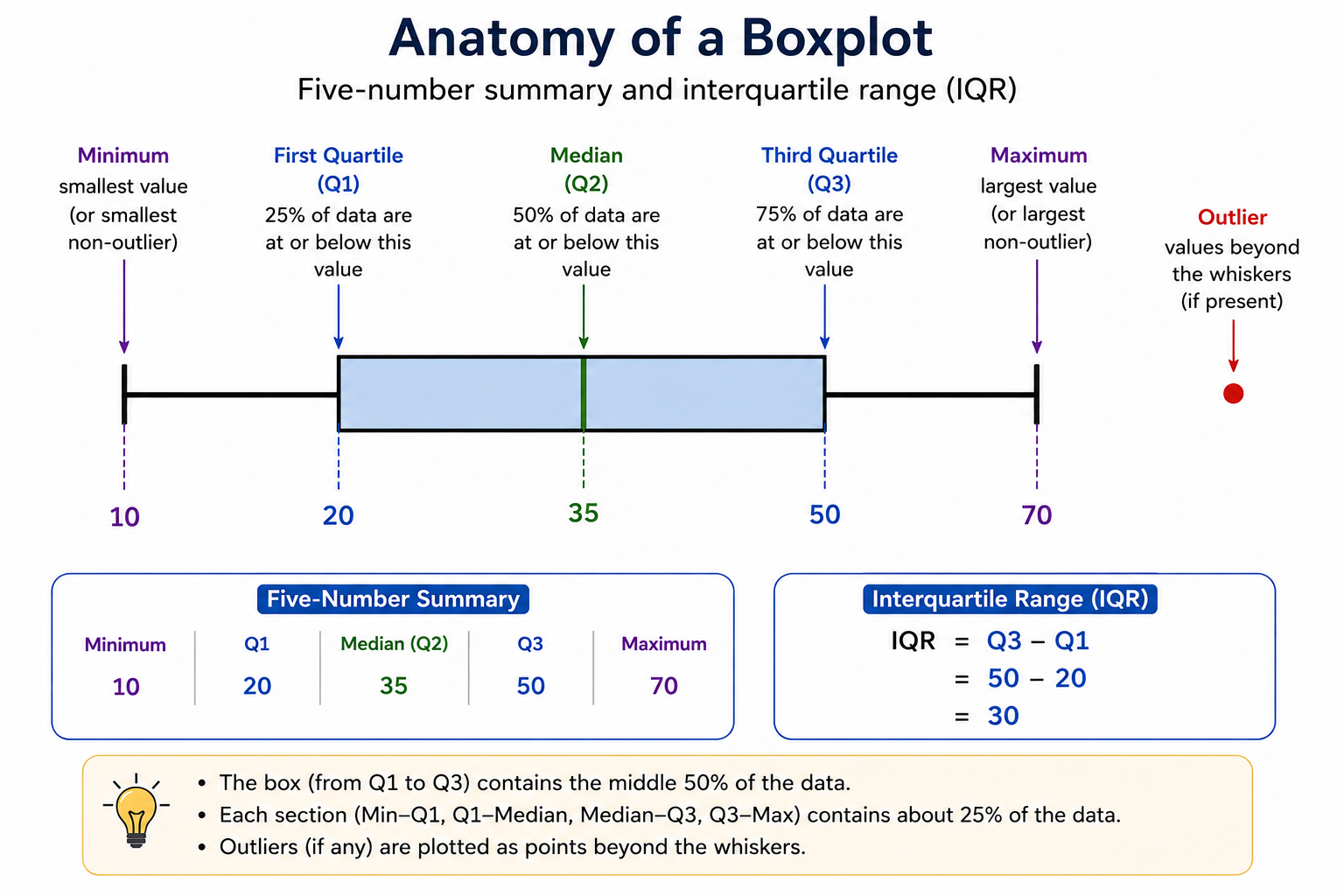
The Five-Number Summary
Suppose a boxplot has:
\[ \text{Minimum}=10 \]
\[ Q_1=20 \]
\[ \text{Median}=35 \]
\[ Q_3=50 \]
\[ \text{Maximum}=70 \]
These five values describe the location and spread of the distribution.
The box extends from:
\[ Q_1\text{ to }Q_3 \]
and the line inside the box marks the:
\[ \boxed{\text{median}} \]
Quartiles
Quartiles divide an ordered dataset into approximately four equal groups.
About:
\[ 25\% \]
of the observations lie in each quartile section:
- Minimum to \(Q_1\)
- \(Q_1\) to median
- Median to \(Q_3\)
- \(Q_3\) to maximum
Each quartile section contains approximately the same fraction of the data, but the sections do not need to have the same numerical width.
A long section means those observations are more spread out.
A short section means those observations are more tightly clustered.
Interquartile Range
The interquartile range (IQR) measures the spread of the middle 50% of the data.
\[ \boxed{ IQR=Q_3-Q_1 } \]
For example, if:
\[ Q_1=20 \]
and:
\[ Q_3=50 \]
then:
\[ IQR=50-20 \]
\[ \boxed{IQR=30} \]
Because the IQR focuses on the middle half of the data, it is less affected by extreme values than the overall range.
Range
The range measures the total spread from the smallest to largest value:
\[ \boxed{ \text{Range}=\text{Maximum}-\text{Minimum} } \]
For example:
\[ \text{Minimum}=10 \]
and:
\[ \text{Maximum}=70 \]
give:
\[ \text{Range}=70-10 \]
\[ \boxed{60} \]
Range and IQR measure different parts of the spread:
- Range → entire dataset
- IQR → middle 50% of the dataset
What Boxplots Reveal
A boxplot can help you compare several features of distributions.
Center
The median represents the center of the dataset.
A larger median generally indicates a higher central value.
Spread
The length of the box represents the IQR.
A longer box means:
\[ \boxed{\text{larger IQR}} \]
and therefore greater spread among the middle 50% of observations.
The whiskers provide information about the spread outside the middle 50%.
Skew
A roughly symmetric boxplot tends to have:
- a median near the center of the box
- similar-sized halves of the box
- whiskers of roughly similar lengths
A right-skewed distribution may show:
- more spread on the right side
- a longer right whisker
- a median closer to \(Q_1\)
A left-skewed distribution may show:
- more spread on the left side
- a longer left whisker
- a median closer to \(Q_3\)
A long whisker can be a useful clue about skew, but do not rely on only one feature.
Look at:
- both whiskers
- the median’s position inside the box
- the widths of the two halves of the box
Outliers
A modified boxplot may show possible outliers as separate points beyond the whiskers.
In this type of boxplot, the whisker may stop at the most extreme value that is not considered an outlier.
So the whisker endpoint is not always the true minimum or maximum of the entire dataset.
The 1.5 × IQR Rule
When a problem asks you to determine possible outliers numerically, a common rule is:
Lower boundary:
\[ \boxed{ Q_1-1.5(IQR) } \]
Upper boundary:
\[ \boxed{ Q_3+1.5(IQR) } \]
Values below the lower boundary or above the upper boundary are considered possible outliers.
For example, suppose:
\[ Q_1=20 \]
and:
\[ Q_3=40 \]
Then:
\[ IQR=40-20=20 \]
The lower boundary is:
\[ 20-1.5(20) \]
\[ =20-30 \]
\[ =-10 \]
The upper boundary is:
\[ 40+1.5(20) \]
\[ =40+30 \]
\[ =70 \]
So values below \(-10\) or above \(70\) would be considered possible outliers.
Common Problem Types
1. Reading the Five-Number Summary
You may be asked to identify values directly from a boxplot.
Remember:
- left whisker endpoint → minimum or smallest non-outlier
- left edge of box → \(Q_1\)
- line inside box → median
- right edge of box → \(Q_3\)
- right whisker endpoint → maximum or largest non-outlier
The exact interpretation of the whiskers depends on whether the plot displays outliers separately.
2. Finding the IQR
Suppose:
\[ Q_1=20 \]
and:
\[ Q_3=45 \]
Use:
\[ IQR=Q_3-Q_1 \]
\[ =45-20 \]
\[ \boxed{25} \]
3. Comparing Centers
Suppose:
\[ \text{Median of A}=40 \]
and:
\[ \text{Median of B}=60 \]
Then:
\[ 60>40 \]
so Dataset B has the higher median.
Therefore:
\[ \boxed{\text{Dataset B has the higher center by median}} \]
This does not mean every observation in B is greater than every observation in A.
4. Comparing Spread
Suppose:
\[ IQR_A=10 \]
and:
\[ IQR_B=25 \]
Since:
\[ 25>10 \]
Dataset B has more spread in its middle 50%.
Therefore:
\[ \boxed{\text{Dataset B has the larger IQR}} \]
5. Comparing Range and IQR
Two datasets can have the same range but different IQRs.
For example:
\[ \text{Range}_A=\text{Range}_B \]
does not imply:
\[ IQR_A=IQR_B \]
Range uses only the two extreme values.
IQR depends on the middle half of the data.
6. Interpreting Quartile Widths
Suppose the interval from \(Q_1\) to the median is very short, while the interval from the median to \(Q_3\) is much longer.
Each section still represents approximately:
\[ 25\% \]
of the observations.
But the observations between the median and \(Q_3\) are more spread out.
7. Identifying Possible Skew
Suppose a boxplot has:
- a long right whisker
- a median closer to the left side of the box
- greater spread to the right
These features suggest:
\[ \boxed{\text{right skew}} \]
Likewise, greater spread toward the left suggests left skew.
8. Identifying Outliers
If a boxplot shows individual points beyond the whiskers, those points typically represent possible outliers.
If quartiles are given instead, use the \(1.5(IQR)\) rule when requested.
9. Comparing Overlap
Boxplots can help compare where two distributions lie relative to each other.
For example, suppose:
\[ \text{maximum of A}<Q_1\text{ of B} \]
Then all of Dataset A lies below at least the middle 75% of Dataset B.
This suggests a substantial separation between the distributions.
Be careful, however, not to infer exact frequencies or individual data values that are not shown.
What a Boxplot Does NOT Show
A boxplot is a summary.
It does not generally tell you:
- every individual data value
- the exact mean
- the exact standard deviation
- the exact number of observations
- how many observations have the same value
- detailed gaps or clusters within each quartile
For example, two datasets can have identical boxplots but contain different individual observations.
The physical length of a section does not tell you how many observations are in that section.
Each quartile contains approximately 25% of the observations regardless of how long or short that section appears.
Strategies
- Read the boxplot from left to right.
- Locate \(Q_1\), median, and \(Q_3\) before answering comparison questions.
- Use:
\[ IQR=Q_3-Q_1 \]
for the spread of the middle 50%.
- Use:
\[ \text{Range}=\text{max}-\text{min} \]
when the true minimum and maximum are shown. - Compare medians when discussing center. - Compare IQRs when discussing the spread of the middle 50%. - Look at the entire shape of the boxplot for evidence of skew. - Remember that longer quartile intervals mean greater numerical spread, not more observations. - Check whether outliers are displayed separately before treating whisker endpoints as the absolute minimum and maximum. - Do not infer information the boxplot does not provide.
Worked Examples
Example 1 — Read the Five-Number Summary
A boxplot has:
\[ \text{Minimum}=10 \]
\[ Q_1=20 \]
\[ \text{Median}=35 \]
\[ Q_3=50 \]
\[ \text{Maximum}=70 \]
The five-number summary is:
\[ \boxed{ 10,\ 20,\ 35,\ 50,\ 70 } \]
Example 2 — Find the IQR
Using:
\[ Q_1=20 \]
and:
\[ Q_3=50 \]
calculate:
\[ IQR=Q_3-Q_1 \]
\[ =50-20 \]
\[ \boxed{30} \]
This means the middle 50% of the observations span 30 units.
Example 3 — Find the Range
If:
\[ \text{minimum}=10 \]
and:
\[ \text{maximum}=70 \]
then:
\[ \text{Range}=70-10 \]
\[ \boxed{60} \]
Example 4 — Compare Two Datasets
Suppose two boxplots have:
\[ \text{Dataset A: Median}=50,\quad IQR=12 \]
\[ \text{Dataset B: Median}=60,\quad IQR=25 \]
Compare their centers:
\[ 60>50 \]
so Dataset B has the higher median.
Compare their middle spreads:
\[ 25>12 \]
so Dataset B also has the larger IQR.
Therefore:
\[ \boxed{\text{B has a higher center and greater middle spread}} \]
Example 5 — Interpret Quartile Width
Suppose a boxplot has:
\[ Q_1=20 \]
\[ \text{Median}=25 \]
\[ Q_3=50 \]
From \(Q_1\) to the median:
\[ 25-20=5 \]
From the median to \(Q_3\):
\[ 50-25=25 \]
Both sections contain approximately 25% of the observations.
However, the upper-middle quarter is spread across a much wider interval.
Therefore:
\[ \boxed{\text{the data are more spread out between the median and }Q_3} \]
Example 6 — Determine an Outlier Boundary
Suppose:
\[ Q_1=20 \]
and:
\[ Q_3=40 \]
First find the IQR:
\[ IQR=40-20 \]
\[ =20 \]
Calculate:
\[ 1.5(IQR)=1.5(20)=30 \]
Lower boundary:
\[ 20-30=-10 \]
Upper boundary:
\[ 40+30=70 \]
Therefore, possible outliers satisfy:
\[ x<-10 \]
or:
\[ x>70 \]
So a value of 85 would be a possible outlier.
\[ \boxed{85\text{ is a possible outlier}} \]
- Confusing IQR with range.
- Using the whisker length instead of \(Q_3-Q_1\) to calculate IQR.
- Assuming a larger range automatically means a larger IQR.
- Assuming the longer side of a boxplot contains more observations.
- Forgetting that each quartile represents approximately 25% of the data.
- Using only one whisker to determine skew.
- Assuming a higher median means every observation in that dataset is higher.
- Assuming a boxplot shows the mean or standard deviation.
- Treating isolated outlier points as whisker endpoints.
- Assuming whiskers always represent the actual minimum and maximum when outliers are shown separately.
Practice Problems
- A boxplot has:
\[ Q_1=20,\qquad Q_3=45 \]
Find the IQR.
- A boxplot has:
\[ \text{minimum}=5,\qquad \text{maximum}=30 \]
with no separately plotted outliers.
Find the range.
- Dataset A has median 32 and Dataset B has median 28.
Which dataset has the higher median?
- Dataset A has:
\[ IQR=12 \]
and Dataset B has:
\[ IQR=20 \]
Which dataset has more spread in its middle 50%?
A boxplot has a much longer right side overall and its median is closer to \(Q_1\). What type of skew does this suggest?
If:
\[ Q_1=30 \]
and:
\[ Q_3=50 \]
find the lower and upper outlier boundaries using the \(1.5(IQR)\) rule.
- The section from \(Q_1\) to the median is twice as long as the section from the median to \(Q_3\).
Which section contains more observations?
1. Use:
\[ IQR=Q_3-Q_1 \]
Substitute:
\[ IQR=45-20 \]
\[ \boxed{25} \]
2. Use:
\[ \text{Range} = \text{maximum}-\text{minimum} \]
\[ =30-5 \]
\[ \boxed{25} \]
3. Compare the medians:
\[ 32>28 \]
Therefore:
\[ \boxed{\text{Dataset A has the higher median}} \]
This tells us about the centers, not about every individual observation.
4. Compare:
\[ 12<20 \]
Dataset B has the larger IQR.
Therefore:
\[ \boxed{\text{Dataset B}} \]
has more spread among its middle 50%.
5. Greater spread toward the right, together with a median closer to \(Q_1\), suggests a longer right tail.
Therefore:
\[ \boxed{\text{right-skewed}} \]
6. First calculate the IQR:
\[ IQR=50-30 \]
\[ =20 \]
Then:
\[ 1.5(IQR)=1.5(20)=30 \]
Lower boundary:
\[ 30-30=0 \]
Upper boundary:
\[ 50+30=80 \]
Therefore:
\[ \boxed{\text{Lower boundary}=0} \]
\[ \boxed{\text{Upper boundary}=80} \]
Values below 0 or above 80 would be considered possible outliers.
7. The width of a quartile section describes how spread out its values are, not how many observations it contains.
The interval from \(Q_1\) to the median represents approximately 25% of the data.
The interval from the median to \(Q_3\) also represents approximately 25%.
Therefore:
\[ \boxed{\text{They contain approximately the same number of observations}} \]
The longer section simply has more numerical spread.
Summary
A boxplot summarizes a distribution using its five-number summary:
\[ \boxed{ \text{Minimum},\ Q_1,\ \text{Median},\ Q_3,\ \text{Maximum} } \]
The middle 50% of the data lies between:
\[ Q_1\text{ and }Q_3 \]
Its spread is measured by:
\[ \boxed{ IQR=Q_3-Q_1 } \]
The overall range is:
\[ \boxed{ \text{Range}=\text{Maximum}-\text{Minimum} } \]
Boxplots can help compare:
- center using the median
- middle spread using the IQR
- overall spread
- possible skew
- possible outliers
Each quartile contains approximately 25% of the observations, even when the visual widths of the sections are different.
- Line inside the box → median.
- Left edge of box → \(Q_1\).
- Right edge of box → \(Q_3\).
- Box length → IQR.
- \(IQR=Q_3-Q_1\).
- Each quartile → about 25% of the data.
- Longer section → more spread, not more observations.
- Compare medians for center.
- Compare IQRs for middle spread.
- Use the whole boxplot when judging skew.
- Separate dots beyond whiskers → possible outliers.